Long Live bbEdit!
posted by DL Byron on May 24, 2012
@danhhoang @panic if it ain’t @bbedit it’s crap.
— byron@bikehugger (@bikehugger) May 24, 2012
Comment
tagged:
posted by DL Byron on May 24, 2012
@danhhoang @panic if it ain’t @bbedit it’s crap.
— byron@bikehugger (@bikehugger) May 24, 2012
Comment
tagged:
posted by DL Byron on April 21, 2012

Next week on Tuesday, I’m talking to Travel Industry suppliers about social. Will post notes and the preso. Also follow me along G+ for more thoughts about modern travel.
Uploaded by Hugger Industries | more from the Hugger Industries Photostream.
Comment
tagged:
posted by DL Byron on March 26, 2012
Most of the posts Byron used to publish here are now on G+
Also follow +Textura Design, +Bike Hugger, and +Clip-n-Seal there.
Comment
tagged:
posted by DL Byron on March 07, 2012
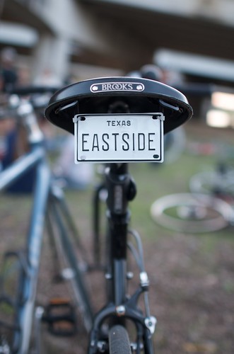
Back in Austin this weekend riding with the locals on the Eastside. Been slammed busy too. Much going on and you can follow along at Bike Hugger and G+.
Uploaded by Hugger Industries | more from the Hugger Industries Photostream.
posted by DL Byron on December 11, 2011
Currents
![]() As an independent publisher of blogs and media, I’m very enthused about Google Currents? Cause it saved me like 80 grand! Bike Hugger is already available in mobile views for browsers and I haven’t been able to justify an app. What Google has done with Currents is make an app dashboard. I tell Currents what feeds to parse and then can curate those feeds manually, or with tags, and upload featured content too.
As an independent publisher of blogs and media, I’m very enthused about Google Currents? Cause it saved me like 80 grand! Bike Hugger is already available in mobile views for browsers and I haven’t been able to justify an app. What Google has done with Currents is make an app dashboard. I tell Currents what feeds to parse and then can curate those feeds manually, or with tags, and upload featured content too.
500 channels
The Web today is like cable with 500 channels. Bike Hugger is on
and then wherever a reader may want to read us on apps like Flipboard, Readability, and Instapaper. Talk about a content strategy! Where I’m challenged is to not just replicate the content from one channel to the next and consider what I’m sending where. For Currents, I’ve plugged in feeds for the blog, photos from G+, YouTube, and will feature content from my travels and events like Built and our Mobile Socials. Considering how easy it is to browse and view videos with Currents, I’ll also get back to more videos in 12.
Comment
tagged:
Browse by Month: 2012
Browse by Month: 2011
Browse by Month: 2010
Browse by Month: 2009
Browse by Month: 2008
Browse by Month: 2007
Browse by Month: 2006
Browse by Month: 2005
Browse by Month: 2004
Browse by Month: 2003
 This practical book explains the real-world techniques, tools and concepts designers and marketers can use to build a blog that enhances their business objectives. Buy It!